
The problem
The monthly report is a spreadsheet someone builds by hand.
Bookings come from one system, revenue from another and member activity from a third. Someone stitches them together at month end, and the totals get argued over. By the time the report shows an empty slot or a member slipping away, it's too late to act.
How it works — on screen
 Click to enlarge
Swipe · tap for full screen
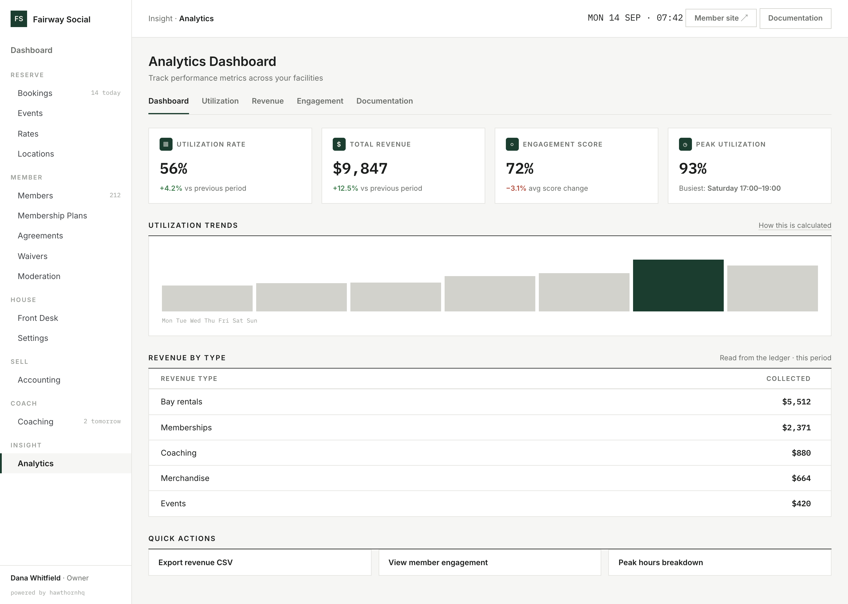
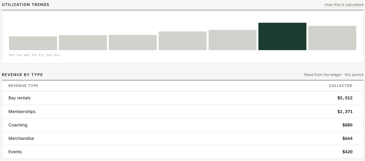
Revenue by type comes from the ledger, the same one your accounting uses.
See how full your bays are, and what you earned.
Utilization is the share of your available hours that are booked, with the busiest day marked. The peak and off-peak split uses your own price windows, the same ones that price your bookings.
Revenue comes from the same ledger as your accounting and is broken out by what earned it: bay rentals, memberships, coaching, merchandise and events.
Does it include shop and coaching income?
Yes. Revenue by type has a line for each: bay rentals, memberships, coaching, merchandise and events.
 Click to enlarge
Swipe · tap for full screen
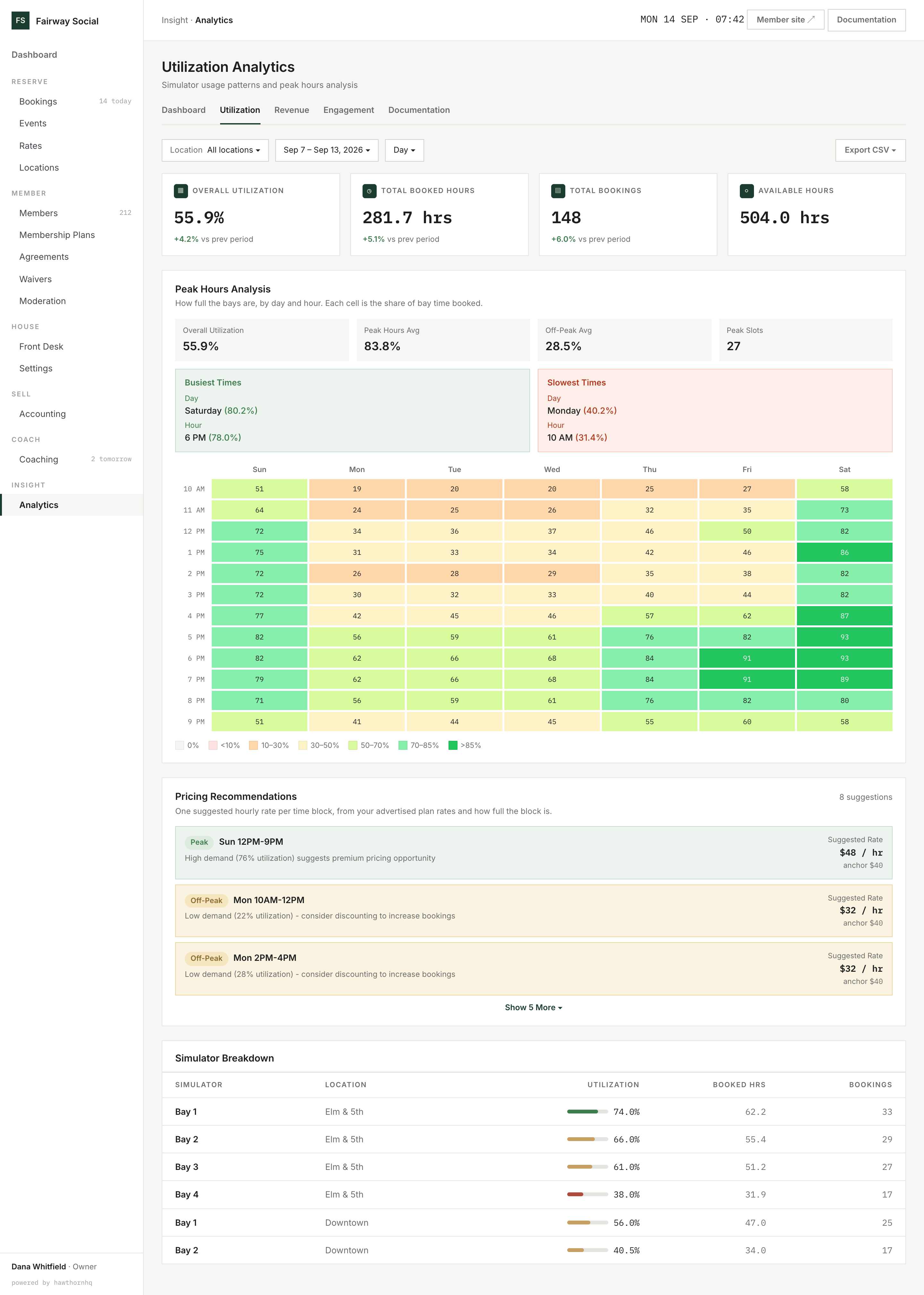
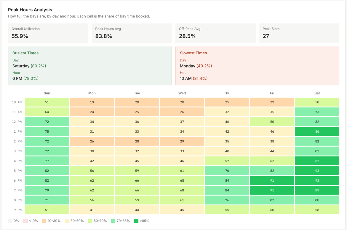
27 busy hours and 12 quiet ones this week, each in the grid.
See the whole week at a glance.
A grid of every day and hour shows how full your bays are, so the busy evenings and the quiet Monday mornings stand out. The busiest and slowest day and hour are called out above it.
Each busy block (70% full or more) and quiet block (30% or less) that runs two hours or longer gets a suggested hourly rate: 20% above your usual rate for busy blocks, 20% below for quiet ones. Your usual rate is the middle of your advertised plan rates.
What should I charge for a quiet hour?
Quiet blocks get a suggested rate 20% below your usual one, with how full the block was beside it. You decide whether to use it.
Click to enlarge
Swipe · tap for full screen
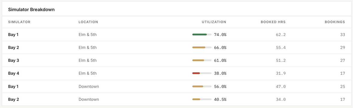
Six bays across two locations, each with its own utilization.
Find the bay nobody books.
Every bay is listed with its utilization, hours booked and number of bookings, across all locations or one. A bay at 38% when the others are above 60% is worth a question: is it the position, the equipment or the price?
Bars turn green at 70% and above, amber from 40% and red below, so the outlier shows without reading the numbers.
Which bay is used least?
The table lists every bay with its utilization. Here, Elm & 5th Bay 4 is booked 38% of the time, against 61–74% for the other bays there.
 Click to enlarge
Swipe · tap for full screen
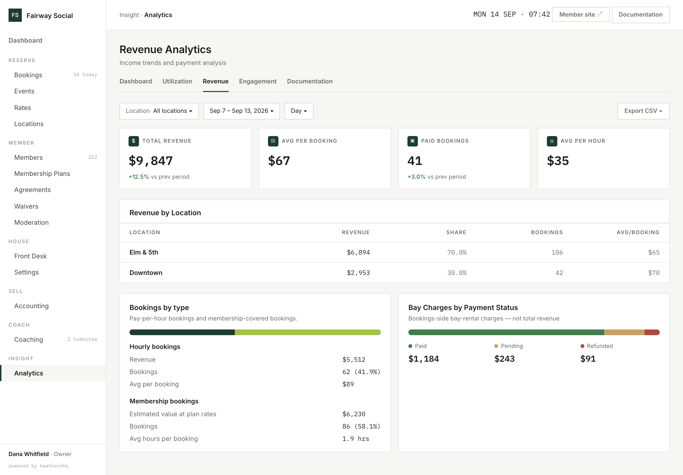
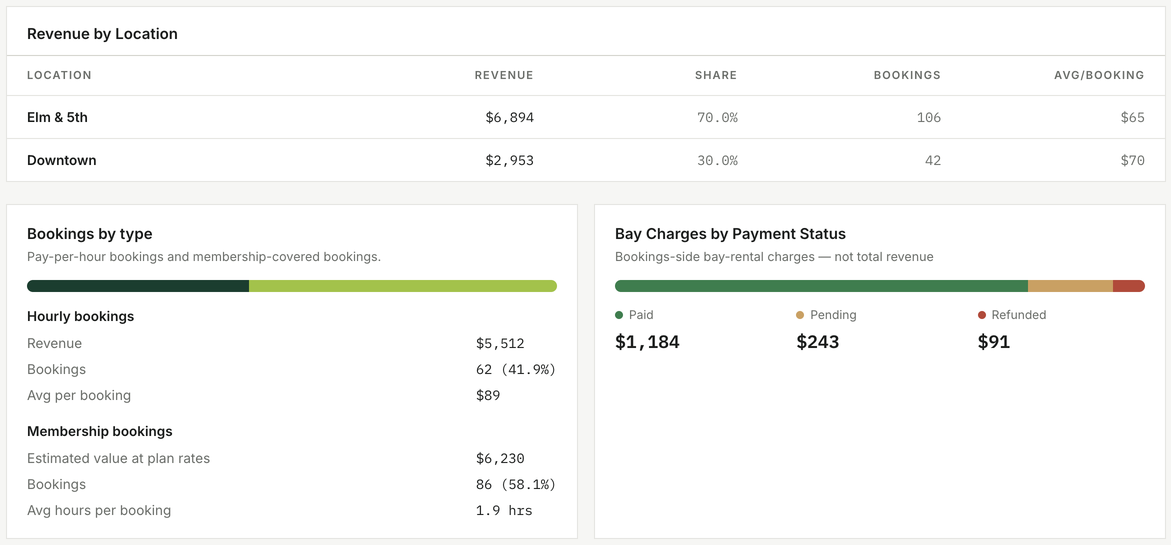
Revenue by location, and what share of bookings memberships cover.
See what each location and each kind of booking earns.
Revenue by location shows each location's revenue, share of the total, bookings and average per booking, so you can compare a busy location with a newer one.
Bookings split into pay-per-hour and membership-covered, with the average value of each. A membership booking has no bay charge, so its figure is an estimate priced at your plan rates, and the screen says so. Bay charges are shown by status (paid, pending, refunded) and labelled as not total revenue.
How much of my bay time do memberships cover?
The split is shown as a share of bookings: 86 of 148 this week, 58.1%, were membership bookings.
 Click to enlarge
Swipe · tap for full screen
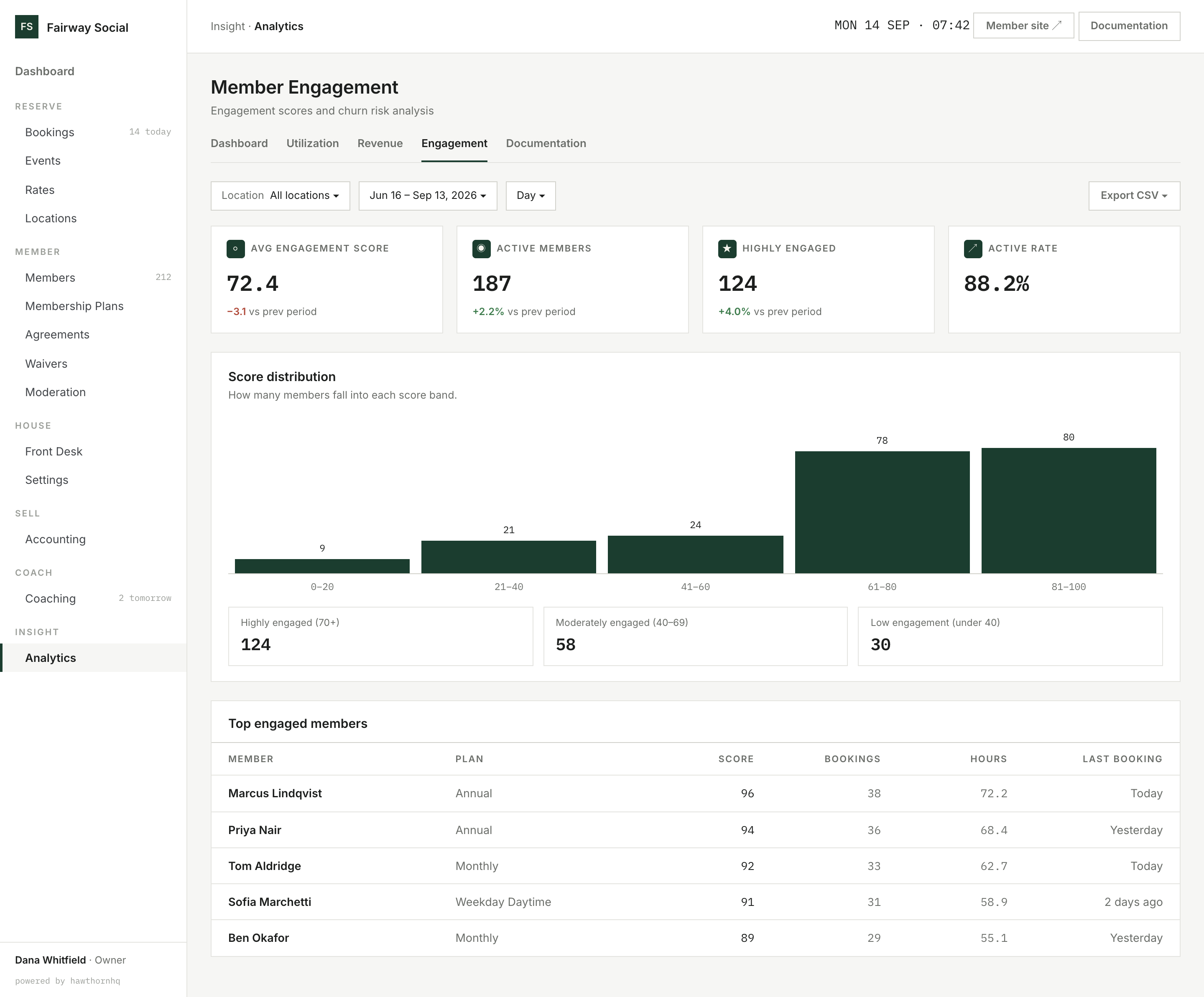
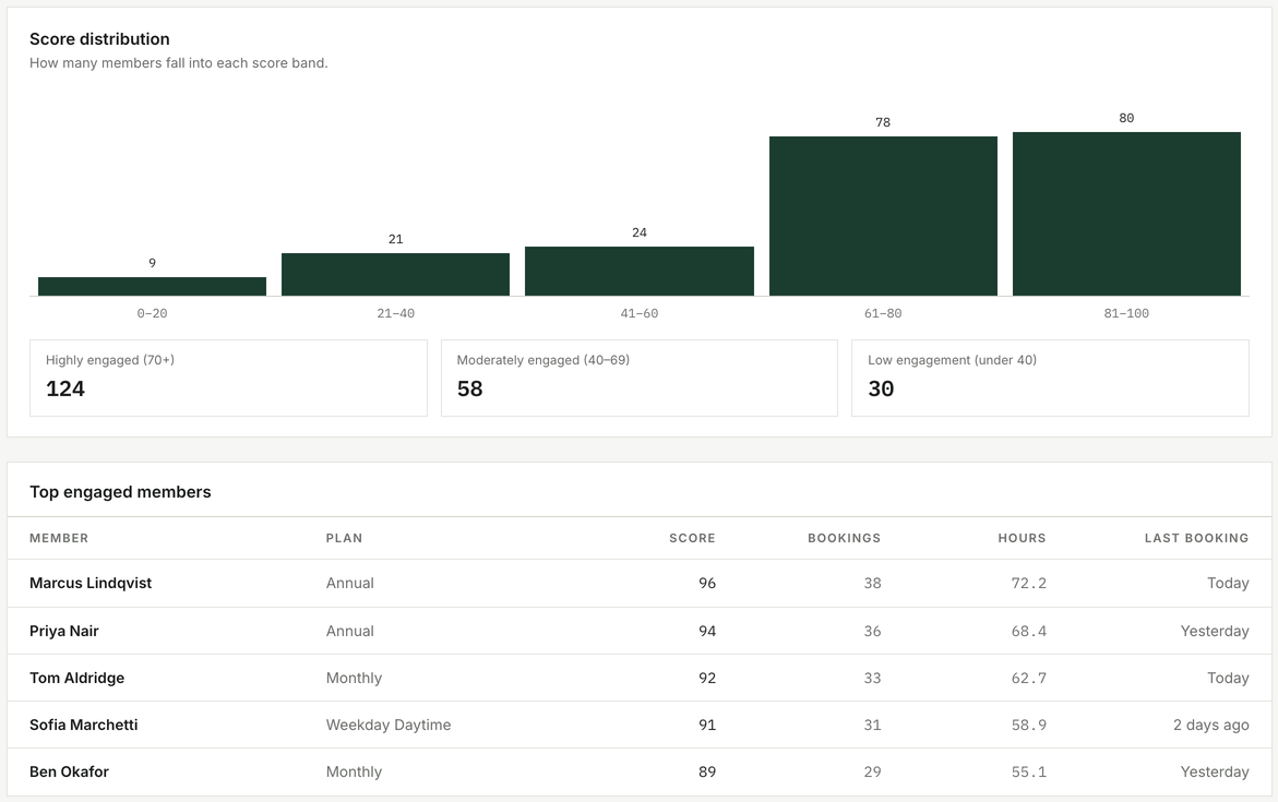
Every member scored 0 to 100, in bands you can act on.
See how engaged your members are, not only who is at risk.
Every member gets an engagement score from 0 to 100. The spread shows how many sit in each band, and members are counted as highly engaged (70 and up), moderately engaged (40 to 69) or low (under 40).
Your most engaged members are listed with their plan, bookings and hours, and export to CSV.
How many of my members are really active?
Active members and the active rate sit beside the average score, each against the previous period: 187 active, 88.2% of members.
 Click to enlarge
Swipe · tap for full screen
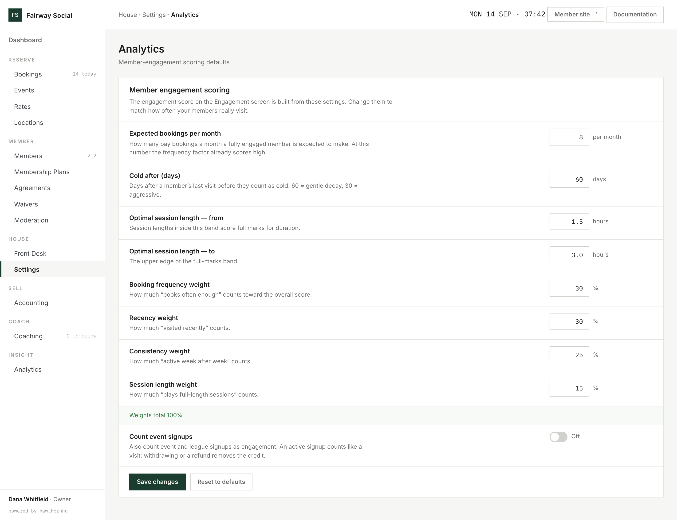
Thresholds, weights and event signups, all in one settings page.
Set what "engaged" means for your club.
A score only helps if it fits how your members actually play. Set how many bookings a month counts as fully engaged, how many days away before a member counts as cold, and the session length that scores full marks.
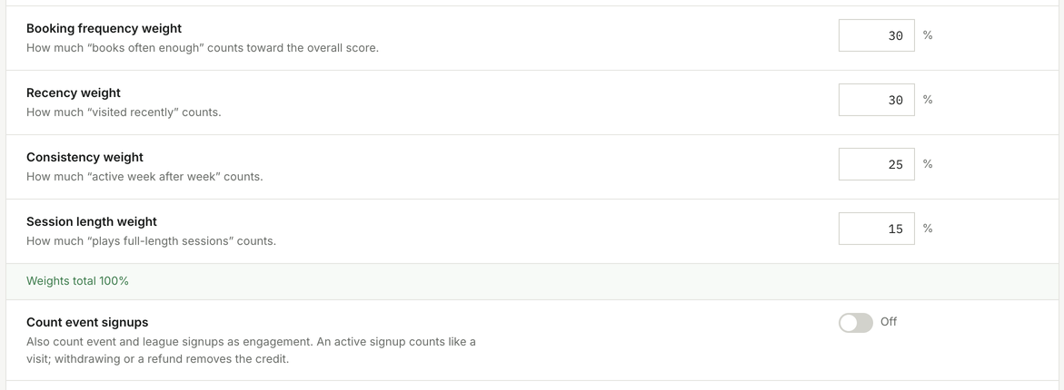
Choose how much each of the four factors counts: how often members book, how recently, how regularly, and how long they play, with the weights totalling 100%. You can also count event and league signups as visits.
Our members visit twice a month, not eight. Will they all look disengaged?
No. Set the expected bookings to match your club and the scores follow. The defaults are 8 bookings a month and 60 days until cold, and you can change them in Settings.
 Click to enlarge
Swipe · tap for full screen
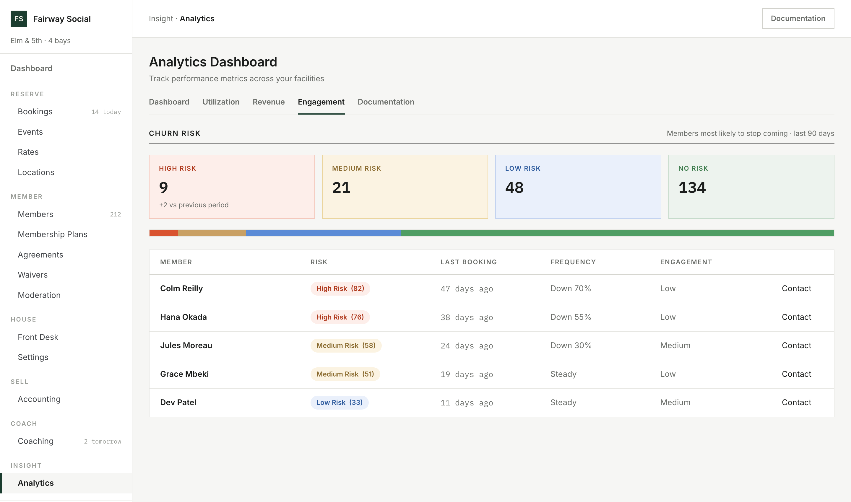
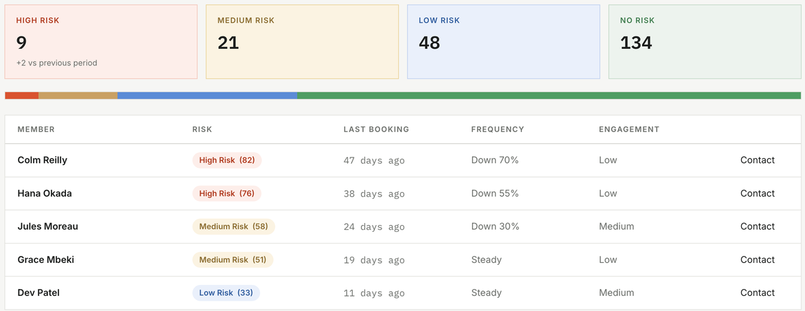
9 members at high risk, each with the facts beside the score and a Contact button.
See which members are drifting while you can still call them.
Each member gets a risk score from how often they book, how recently, how regularly, and how long their sessions run. The list shows the facts behind each score, such as 47 days since the last booking and bookings down 70%, so a call is a conversation, not a guess.
Contact opens an email to the member. Every figure has a plain explanation in the app: the formula, the benchmark range and what to do about it. Any view exports to CSV.
How many members are at risk right now?
The count for each risk level, with the change from the previous period: 9 at high risk, 2 more than last period.
What goes away
The month-end spreadsheet.
- Bay use counted off the calendar by hand utilization by hour
- Revenue assembled from three systems read from the ledger
- Guessing which members have gone quiet scored and listed
- A flat price for every hour a suggested rate per time block
- Wondering whether a bay earns its place utilization by bay
- Guessing what "engaged" means scored to your own rules
- Rebuilding the report for each location one location, or all of them
Nearby
Insight is one verb of six.
Straight answer
What reporting doesn't do yet.
Reports by product. Revenue breaks out by type, but there's no sales-by-product, best-seller or membership-mix report yet.
The at-risk score isn't adjustable. Engagement scoring is yours to set, but the at-risk score uses fixed weights. It's built from booking behaviour, so it's a prompt to call someone, not a forecast.
Comparisons are to the period just before. You can't yet compare with the same weeks last year, and reports don't factor in weather or season.
Peak hours depend on your price windows. A time that no price window covers counts as off-peak.
Asking questions in plain language. Reports are dashboards. You can't yet ask an assistant questions about your numbers.